 Finally it is time for the first feature of Cover flips, where we closely study the variation between book covers over the world! It sounds very nerdy and I'm not sure it is as nerdy as it sounds. This has been done by many people, but just sit back and enjoy.
 Lets crack on!
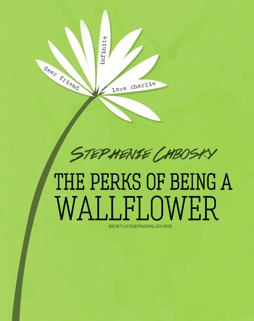
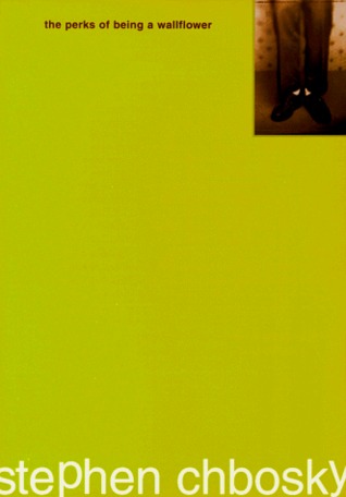
PERKS OF BEING A WALLFLOWER
Charlie is a freshman.
And while he's not the biggest geek in the school, he is by no means popular. Shy, introspective, intelligent beyond his years yet socially awkward, he is a wallflower, caught between trying to live his life and trying to run from it.
Charlie is attempting to navigate his way through uncharted territory: the world of first dates and mix tapes, family dramas and new friends; the world of sex, drugs, and The Rocky Horror Picture Show, when all one requires is that perfect song on that perfect drive to feel infinite. But he can't stay on the sideline forever. Standing on the fringes of life offers a unique perspective. But there comes a time to see what it looks like from the dance floor.
MY THOUGHTS ON THE COVER AND BLURB
I have read this book. I prefer the cover on the left, it just seems so much more inviting and happier and to me seems to have more relevance to the actual book. The one on the left is just ugly, I mean its a dodgy lime colour and has a pair of legs that look like a guy from the 1930's, I don't know.
The blurb is ok, in my opinion it's not a strong storyline and I found it very, very, excruciatingly difficult to read it and to force myself to the end. I think somebody told me to read it, so I brought it and was like "okay lets start!" without reading the blurb, or maybe I was drunk... who knows?
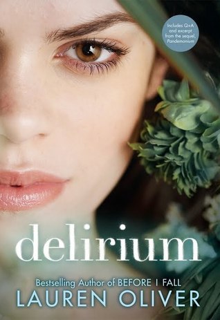
DELIRIUM
Ninety-five days, and then I'll be safe. I wonder whether the procedure will hurt. I want to get it over with. It's hard to be patient. It's hard not to be afraid while I'm still uncured, though so far the deliria hasn't touched me yet. Still, I worry. They say that in the old days, love drove people to madness. The deadliest of all deadly things: It kills you both when you have it and when you don't.
MY THOUGHTS ON THE COVER AND BLURB
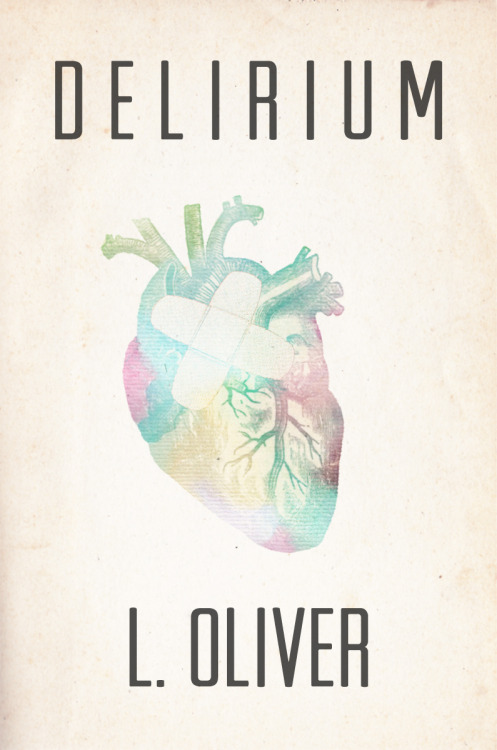
Ok, the cover on the left I found on Tumblr and it intrigued me, the caption for it was "Delirium Coverflip → What the Delirium cover might have looked like had it been written by a male author, inspired by Maureen Johnson’s challenge"
The cover isn't a published cover or anything I don't think, I know it completely defeats the objective but its hypnotising. Is it just me that thinks it is absolutely perfect. I like a book that has a good cover, that I can show off to people as I walk around with my school books and my reading book with the perfect cover perched on the top.
The blurb is writing brilliantly, I love blurbs that have quotes on them. You knind of know then what to expect from the book
CATCHER IN THE RYE
Since his debut in 1951 as The Catcher in the Rye, Holden Caulfield has been synonymous with "cynical adolescent." Holden narrates the story of a couple of days in his sixteen-year-old life, just after he's been expelled from prep school, in a slang that sounds edgy even today and keeps this novel on banned book lists. It begins,"If you really want to hear about it, the first thing you'll probably want to know is where I was born and what my lousy childhood was like, and how my parents were occupied and all before they had me, and all that David Copperfield kind of crap, but I don't feel like going into it, if you want to know the truth. In the first place, that stuff bores me, and in the second place, my parents would have about two hemorrhages apiece if I told anything pretty personal about them."
His constant wry observations about what he encounters, from teachers to phonies (the two of course are not mutually exclusive) capture the essence of the eternal teenage experience of alienation.
MY THOUGHTS ON THE COVER AND BLURB
I like both of the covers, I mean lets be honest they both look cool. I haven't read this and it seems like a must read, but the two covers lack similarity. If I had read this book I could say one doesn't have much relevance to the story. However you cannot judge a book by its cover, I remember being told this in Primary School browsing through the 'free readers' books. Actually the first time I actually experienced book heart break I was seven and had read black beauty, it ruined me to say the least.
Anyway, the blurb seems awesome and I have only just read it. I cant believe it, I dont know whether this is my sort of book. But I do believe that Celine has read it.
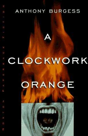
A Clockwork Orange
A vicious fifteen-year-old "droog" is the central character of this 1963 classic, whose stark terror was captured in Stanley Kubrick's magnificent film of the same title.
In Anthony Burgess's nightmare vision of the future, where criminals take over after dark, the story is told by the central character, Alex, who talks in a brutal invented slang that brilliantly renders his and his friends' social pathology. A Clockwork Orange is a frightening fable about good and evil, and the meaning of human freedom. When the state undertakes to reform Alex—to "redeem" him—the novel asks, "At what cost?"
MY THOUGHTS ON THE COVER AND BLURB
I love the covers both of them are totally different but captivating and eye catching. The one on the left I think would appeal to more teenagers, because it looks more modernised than the one on the right.
The blurb looks awesome, it seems very deep. I love books in which question our existence and how bad our future is going to be, it leaves my mind to wander in crazy places.
I'm sorry this is such a short, late post. I am very tired and hope you all don't crave your bed as much as I do right this minuet.
MY BLOG IS BETTER THAN YOUR VLOG
ELLIE


No comments:
Post a Comment